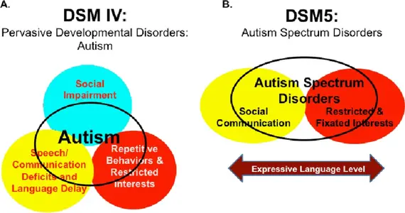
This graphic was created with the idea to present in a simple and clean way the difference on the diagnosis criteria between the 2 versions of the Diagnostic and Statistical Manual of Mental Disorders...
First of all, just the idea of creating a graphic design between the 2 is by itself... a haunted idea... and so.... here we are...
So lest break this down to the design elements.
Before Social Impairment was orange on an aquamarina circle. Now, it is black on a yellow circle.
Before Special Interests where white on a red background. Now, the background is the same color but a different shape, the noticeble change, however, is the copy is now black.
Before Comunication was red on a yellow background. Now, it is white on a solid marron spectrum. And this is the most significant change between the 2... if you take play-doh on all the colors of the spectrum and mix them together to a point where they all become a solid color... it have to be this maroon we see here.
So to the question: what all this means?
I have not idea, but I find it interesting.