I think regardless if your focus is on stomping out some general stereotypes of Autism or focusing instead on highlighting some positives, you will not be able to please all, as some here wished they never had Autism or are struggling much with such, some others seem at the other end and focus on the strengths of being Autistic or they are proud of who they are, while a bigger percentage are perhaps in-between and they may be sort of neutral to their condition, meaning they see both pros and cons--strengths and limitations--from having Autism.
So, my views on what I liked about the design would likely differ from others, and from yourself if you are an NT. As I am a more positive person, I likely would not have the stereotypes being foot stomped out, as I feel it calls more attention to negatives that many rather not advertise more. Also, most may have not even noticed that as symbolic of a foot anyway above the red words. If you are going to do that, put a little more graphic there, like some boot shape there, etc., to highlight that disgust with the stereotypes more, and so many do not overlook that part of the design.
I realize though you probably made the red stereotypes smaller font, symbolic of you wanting them to go away, and you also may have decided it to not be in the center of the design as it would call attention more to those negatives. And perhaps you did not try to be more specific about the stereotypes for the same reasons of reinforcing those. But, overall, I would have preferred a more positive design about Autism, to offset the far more negative specific stereotypes that exist too much. But, I balance that with, "But, this could be unfair to those who are really suffering from the condition they were born with?"
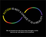
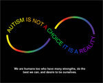
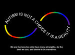
Overall, I just feel listing or implying any negatives, even if the purpose was to have public perception change there, may not sway many to stop those or other stereotypes. If Autism cannot be changed or should not be changed much anyway, for many who believe that, and from seeing many on the Spectrum against those who are pushing for that, perhaps I feel a more better design would either be more focusing on either the positives of Autism, or more neutral message, where we are humans too who have many strengths too, desiring to be ourselves and do the best we can.
When you say "Autism is not a choice It is reality" this I do not have much problem with, as more persons than not would not find offense there but truth. The infinity symbol is often overused I feel, so if I were a new designer I may have tried to come up with something else. The Blue A and Green A seem a bit bland because of the one color. I'd have made it up to three to four colors maximum. I am biased in liking blue, red, white and black/gray, so I personally would have used more of those colors in any letter A. You did blue, black and red words, but I'd have had those colors more on the A.
I likely would have changed the font or design of the A, to have it stand out more, and perhaps I'd have used an acrostic message in the design somewhere focusing on Autism strengths, like by changing the title to: Autism: Absolutely Unique, Totally Interesting, Specially Motivated. Whether these words were in the letter A or forming the letter A, those are examples. Would not a more uplifting message cause perceptions to change for the better more? Also, you could then list on the design some specific examples of varying talents, skills and traits, like pattern recognition, logic, memory, facts, details, pitch, truth, routine, rules, science, etc.
But again, everybody would have their own ideas there. I just know if NTs don't advertise their limitations, needs or any negative things on a design why should Autistics? Make them get the other side of Autism.

")